AI identification for birdwatchers
A bird photo should be the beginning of a discovery. For Birda users, uncertainty about the species could stop that moment becoming a logged sighting. Photo ID let people compare suggestions, make a decision and keep going when the model was unsure.


Context
Birda is a community app where birders log what they see, learn about species and share their sightings with others. Its users have different levels of experience: experienced birders bring established knowledge and rely on trusted tools, while beginners are still learning to identify what they spot. Birda is an early-stage startup competing with well-known birding apps, so credibility matters with both audiences. I led the end-to-end design of Photo ID, from discovery through to launch.
Goal
Let people log a bird they cannot name
To log a bird you had seen, you first needed to know what it was. If you did not, you could search manually or log it as an unidentified species and wait for the community to help. Both worked, but both left the sighting waiting, on a search or on someone else's answer.
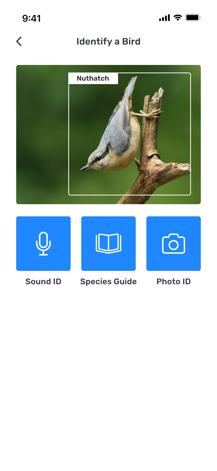
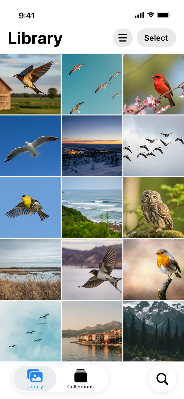
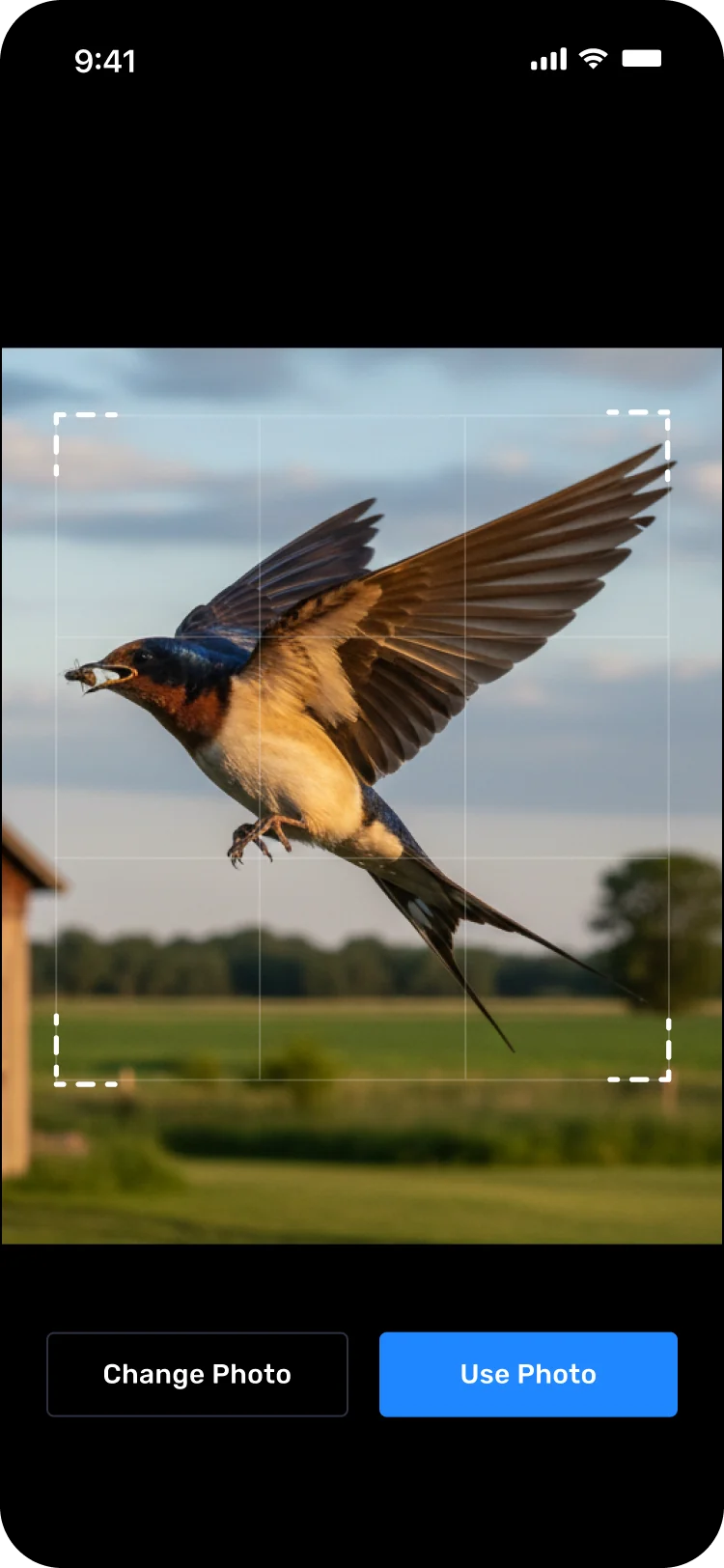
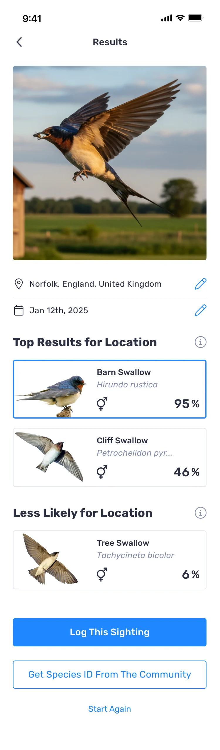
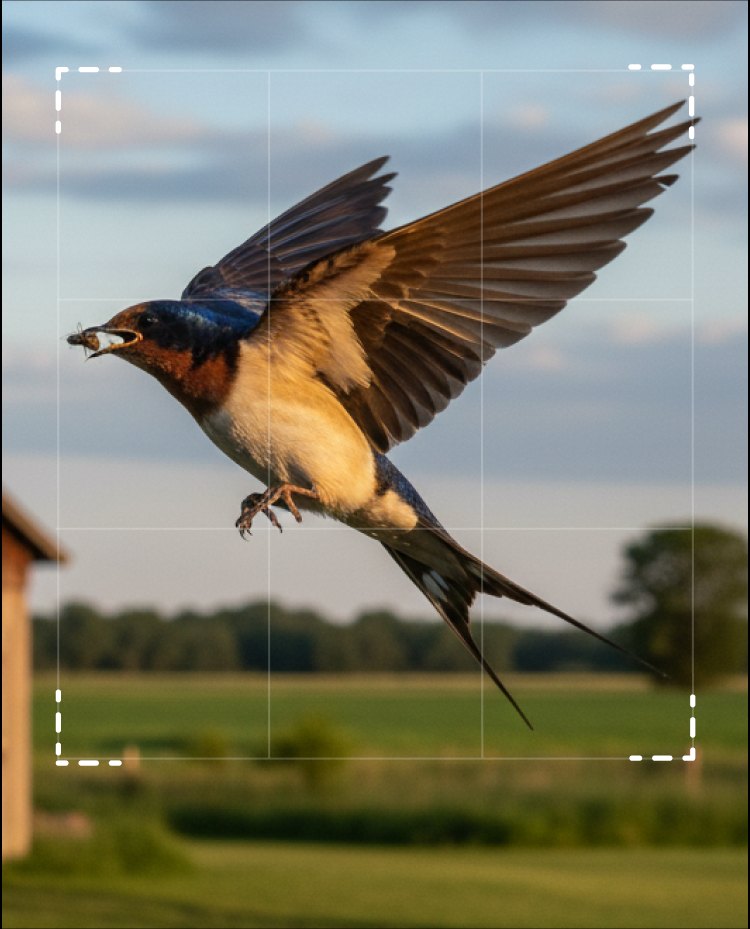
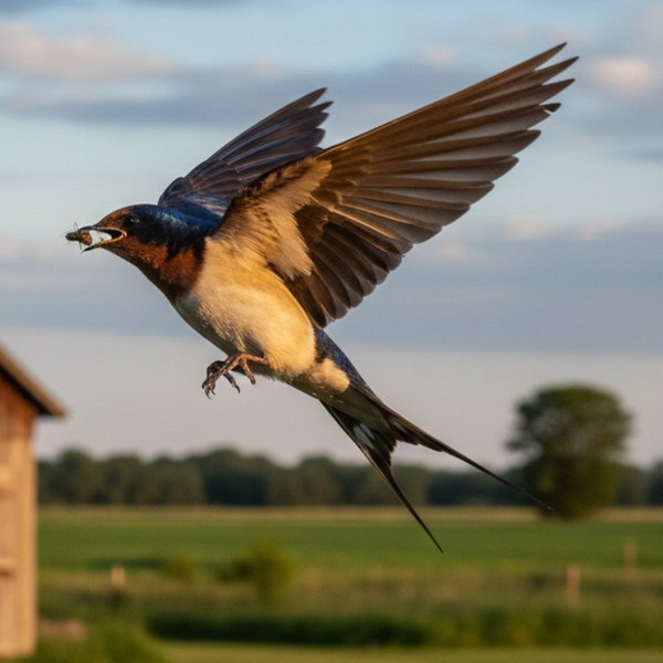
We wanted people to identify a bird from their own photo, inside Birda, and finish the sighting there and then. Photo ID made that possible: take or upload a photo, get likely matches, choose the species and carry on logging.
Why
The user need was clear. Photo ID also had to earn its place on the roadmap, and it did, for three reasons.
User demand
Photo ID was our most requested feature. People wanted to log what they saw without stopping to search for a name.
Stay competitive
AI identification was already the standard. Not having it made Birda look behind Merlin, the app most birders already had on their phone.
Drive Birda+
Photo ID was planned as a key feature of Birda+, our premium subscription, and a strong reason to upgrade.
Research
Before designing anything, I needed to understand how birders wanted identification to work, and what would make them trust a species name the app had given them.
- User interviews. Talked to birders, from complete beginners to experienced recorders, about how they identified birds and what would make them trust an AI answer.
- Co-design workshops. Participants sketched their own Photo ID flow, showing what they expected, what they valued and what they needed in order to trust it.
- Customer support. Read through support requests to find the frustrations and unmet needs that came up again and again.
- Competitive analysis. Looked at how other apps handle the whole identification experience, from taking the photo to what happens when the AI is unsure, and where Birda could do it differently.


Co-design workshops. Participants sketched how they expected Photo ID to work, from taking the photo to choosing a species and saving the sighting


Part of the research behind Photo ID: interviews and co-design with birders, affinity mapping, a journey map of how identification worked before and a competitive analysis of how other apps handle it. This is what shaped the direction I took
What I learned
Four insights came out of the research, and each one shaped a decision.
People gave up before they started
A blurry or distant photo made people assume the app would fail, so they never tried. "My photo was blurry. I did not even try to identify it."
People wanted the reasoning, not just the answer
A single species name felt like a black box. Birders wanted to see why, so they could check it themselves before logging.
Beginners wanted guidance, experts wanted evidence
Beginners needed reassurance they were not getting it wrong. Experienced birders verify anyway, and wanted something to verify against.
A fallback is a feature
People accepted that the AI would sometimes be unsure, as long as there was somewhere to go next.
We were building an AI feature people could already get elsewhere, so Photo ID could not win on accuracy alone. It had to win on trust.
Process
Turning the research into an MVP
The research showed me what people expected from Photo ID: more than one possible match, enough information to choose for themselves, and somewhere to go when the AI could not identify the bird. We needed to get the first version out quickly, and we already had a clear direction for what to build.

Design principles
I turned the research into four principles. They helped us make decisions quickly and keep the first version focused on getting from a photo to a logged sighting.
- Simple capture · from insight 01Make it easy to try, even with an imperfect photo.
- Transparent results · from insight 02Show alternatives and confidence so people can compare the results and choose for themselves.
- Low-friction logging · from insight 03Keep the path from identification to logging as short as possible.
- Safe fallback · from insight 04If Photo ID cannot identify the bird, always give people another way forward.
Mapping the complete experience
The core journey was simple, but making it work meant accounting for different outcomes, missing information and ways to continue when Photo ID could not return a clear result.

Turning the flow into screens
The next step was to turn that logic into screens. Wireframes first, so we could agree the structure before moving into visual design.

Solution
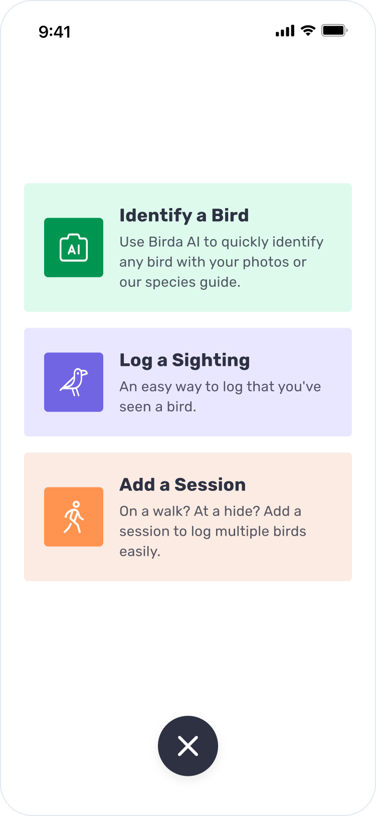
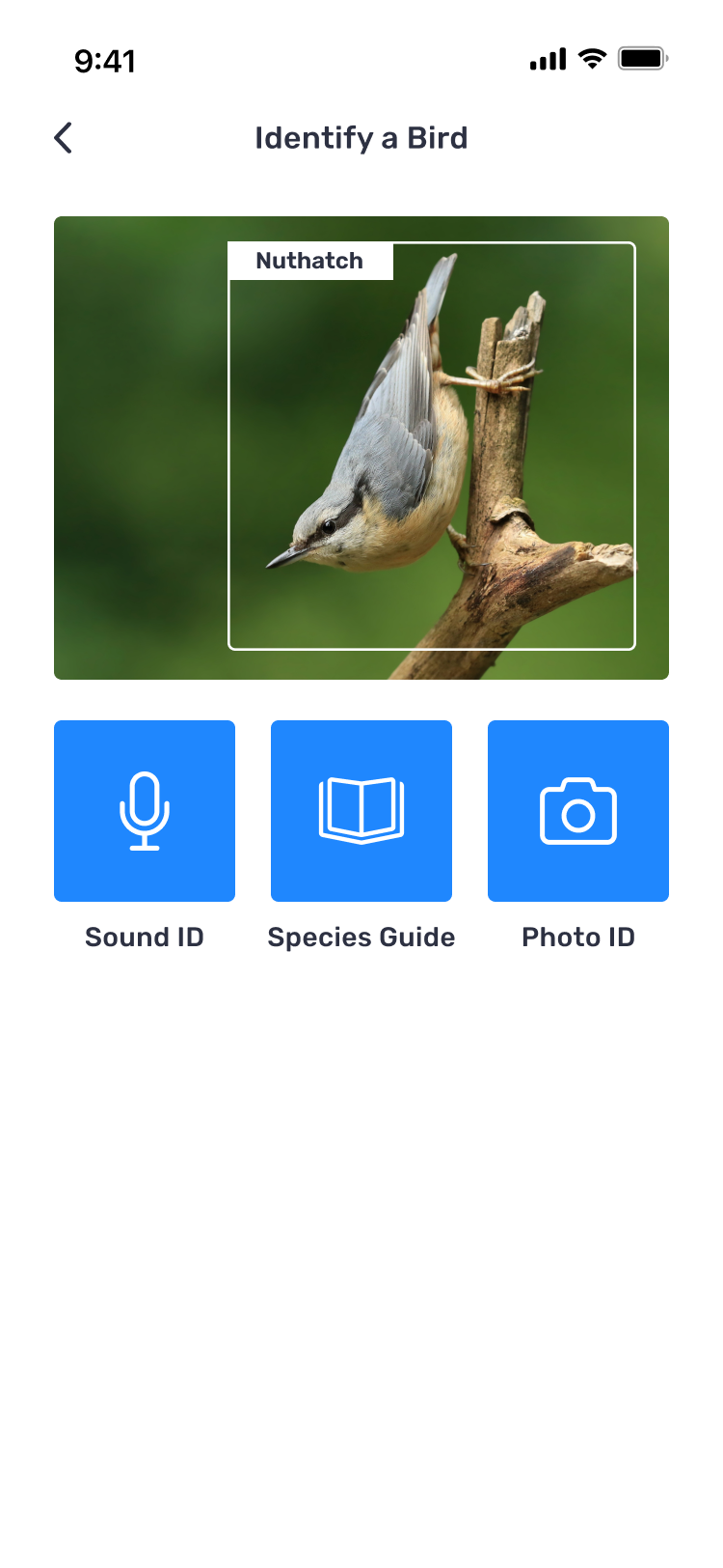
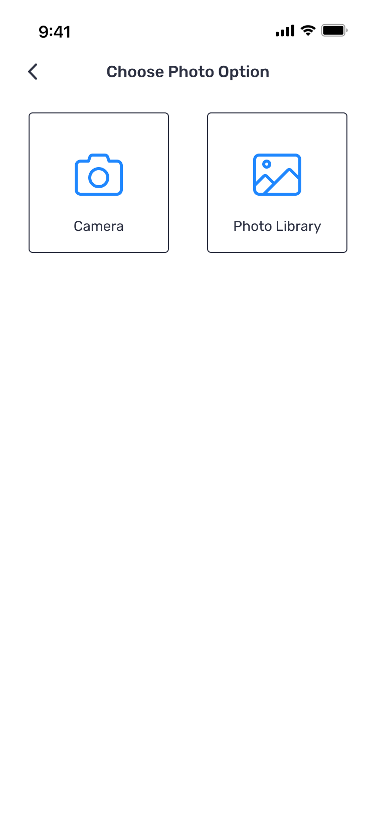
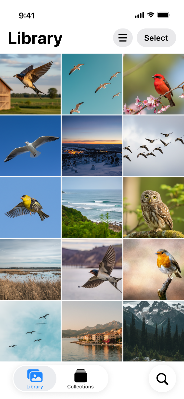
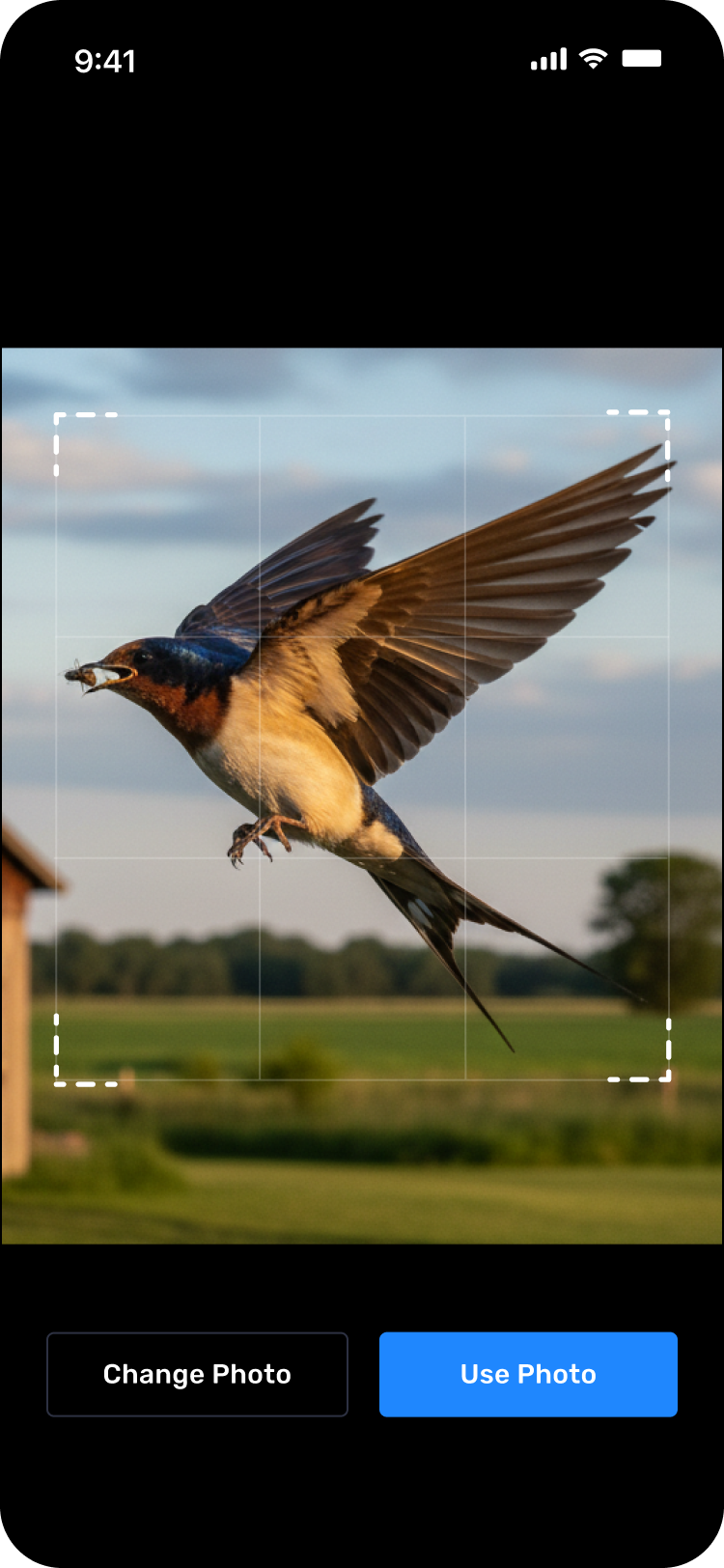
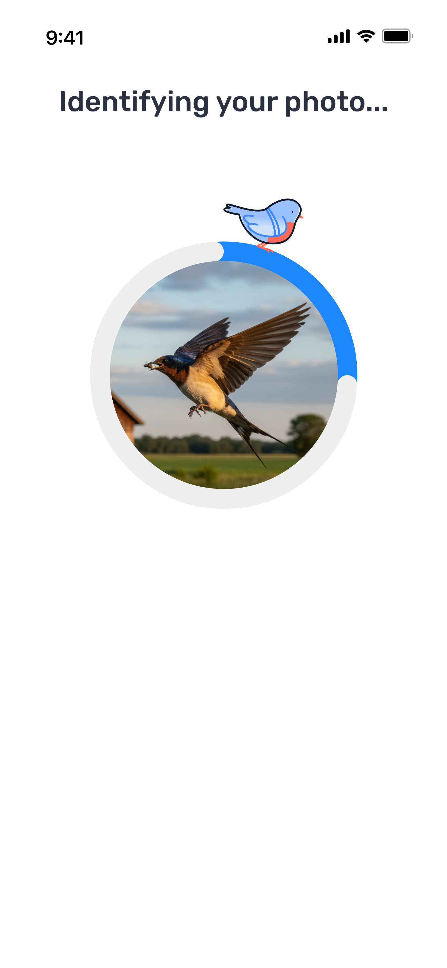
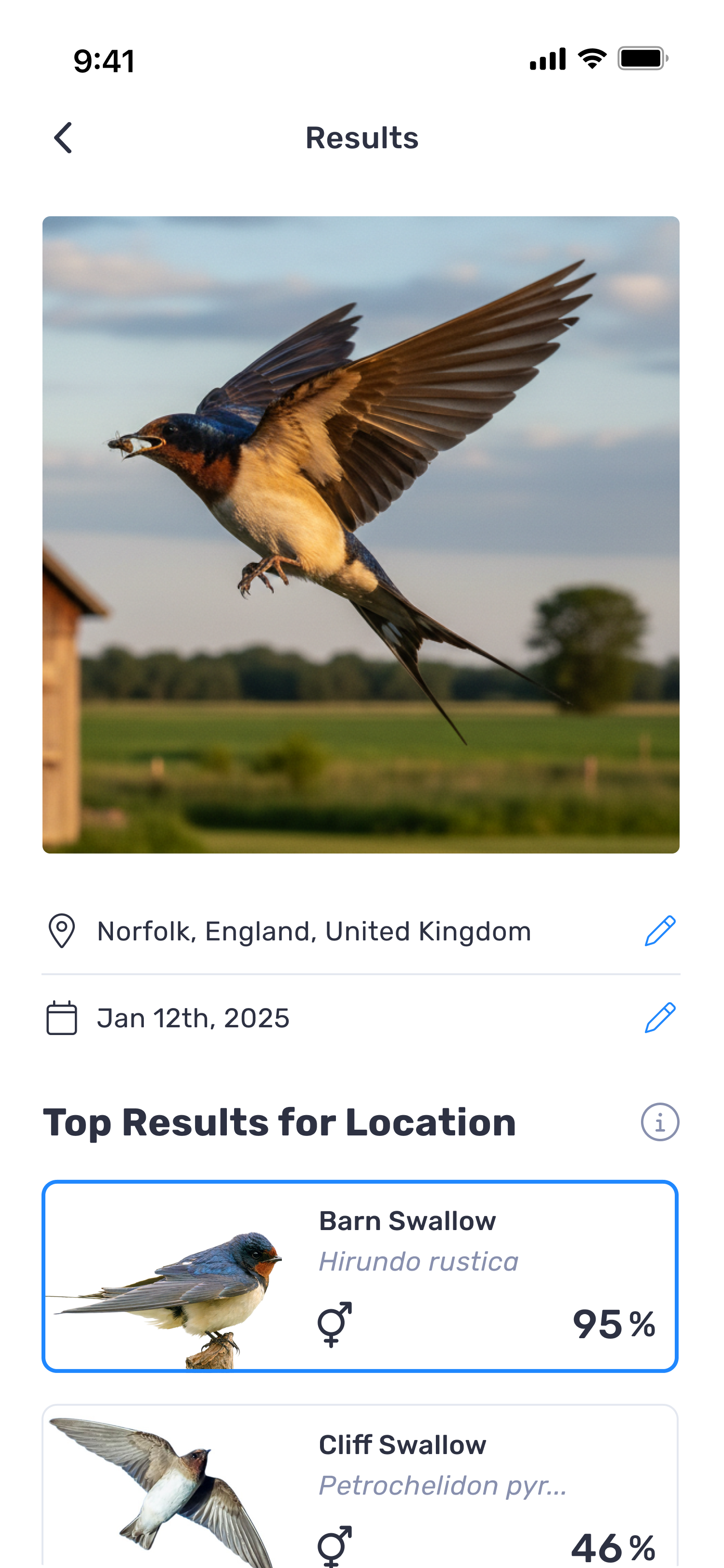
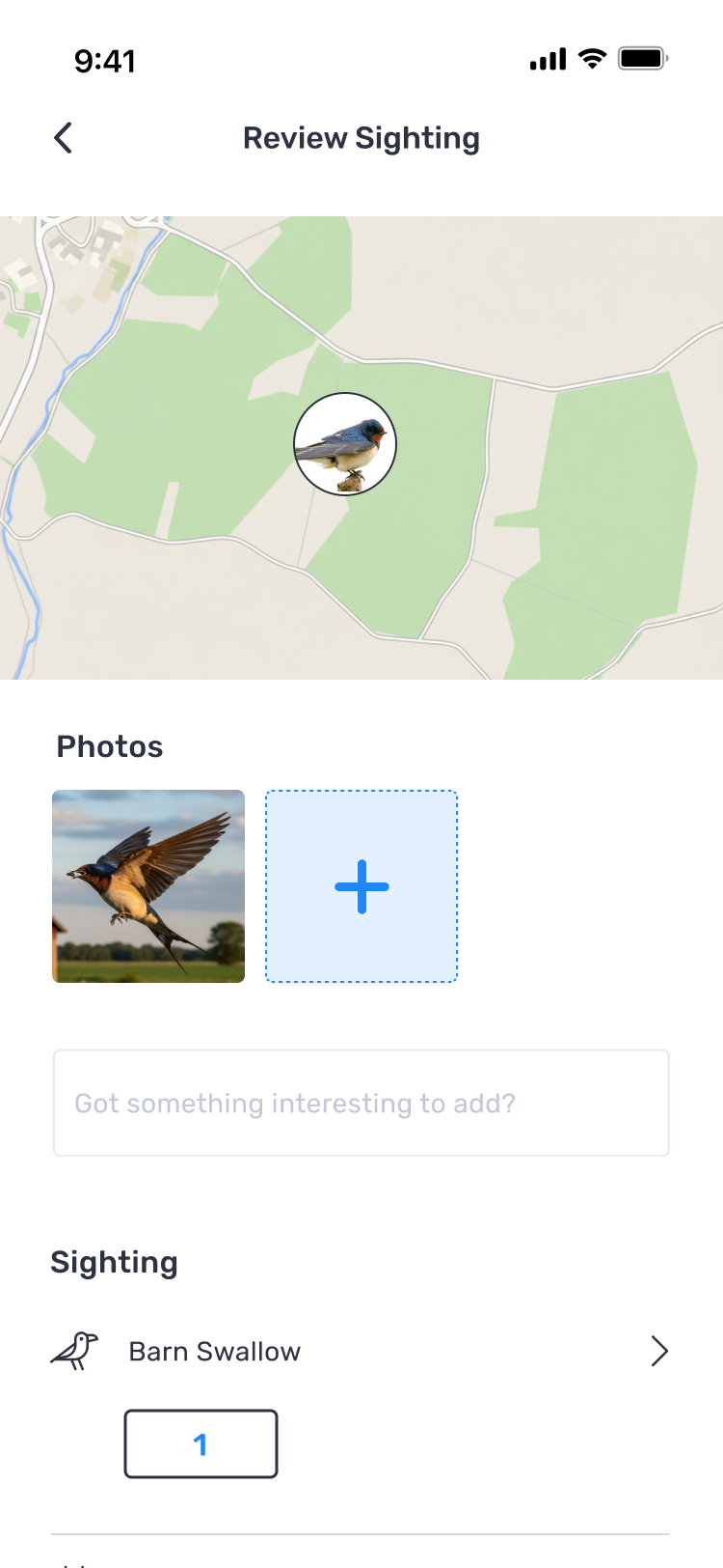
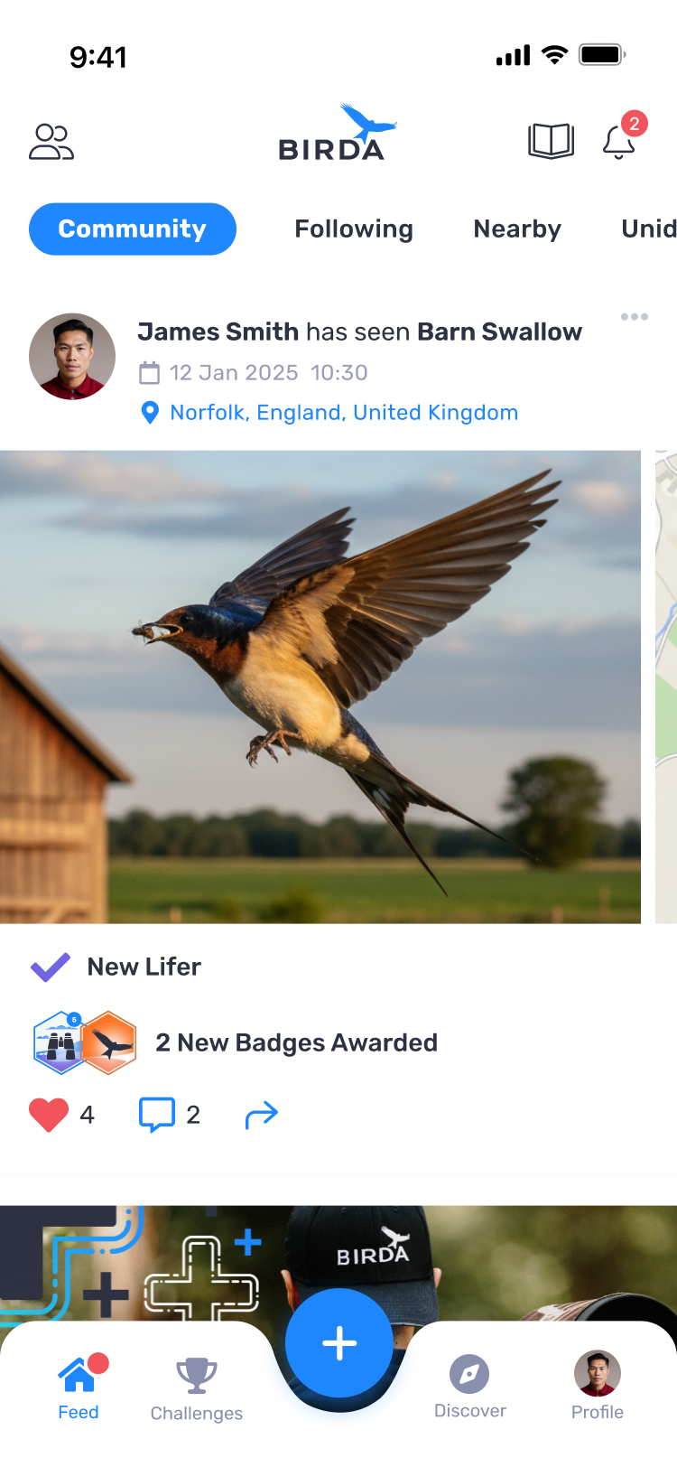
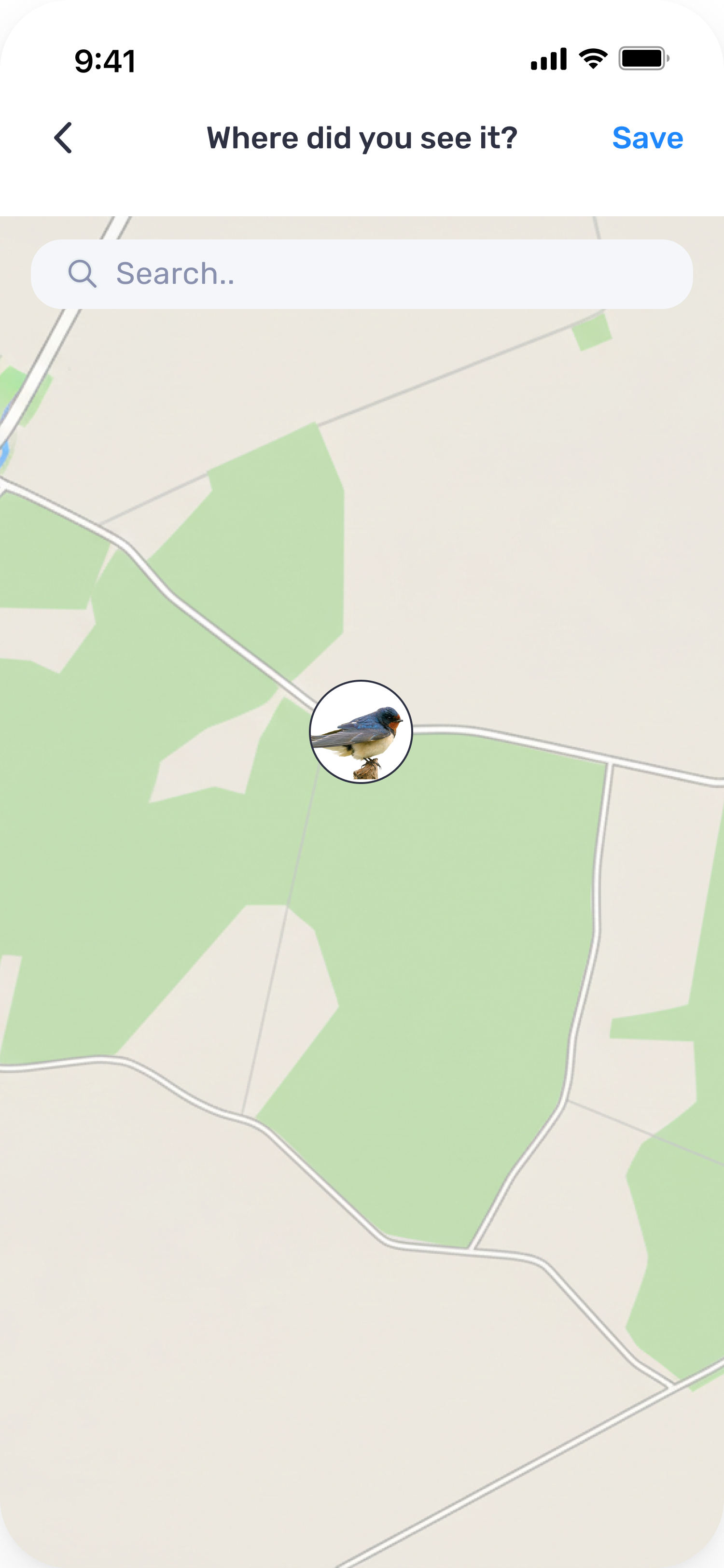
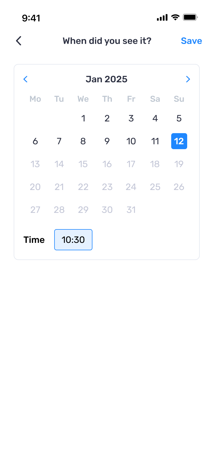
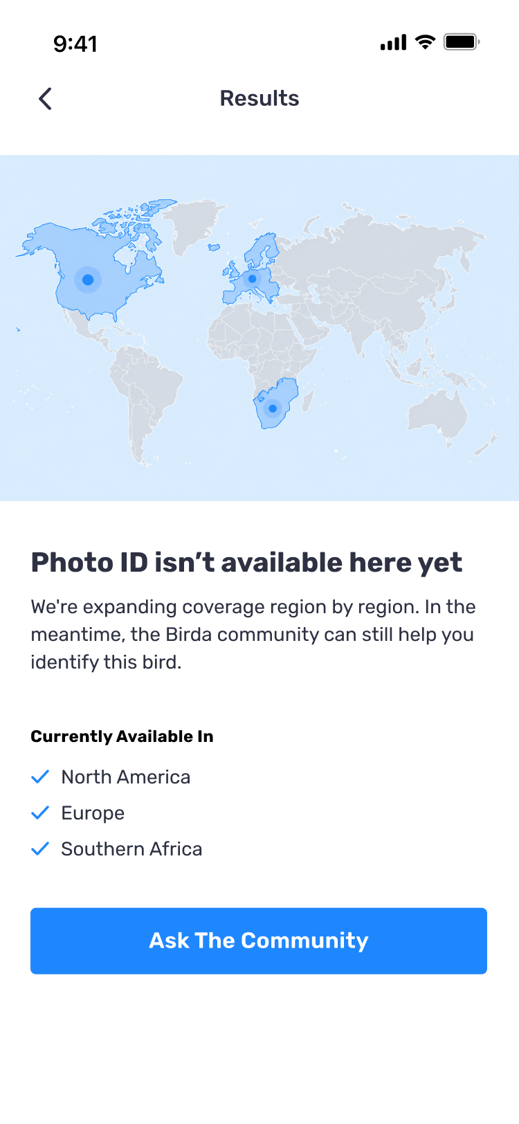
The final UI
With the structure agreed, the wireframes became the final UI, fallback screens included.

The visual system
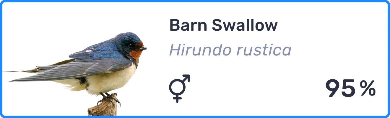
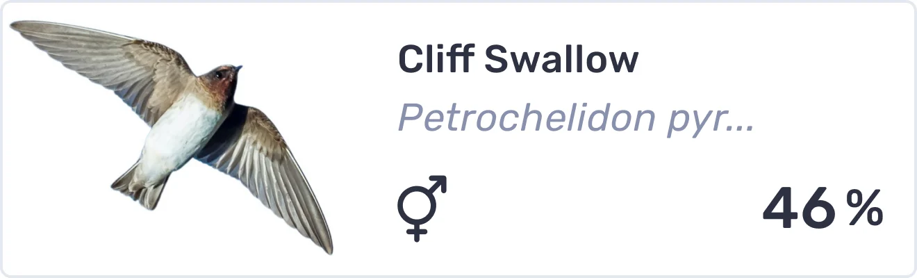
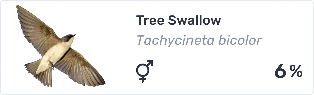
The match card is where people make their choice. This is how it is built, from type and colour to states, actions and icons.

What each decision cost
Each of these made Photo ID better in one direction and worse in another.
Confidence vs certainty
Rather than presenting the AI's answer as definitive, I showed ranked matches with confidence scores, so people could see how sure the model was about each match. The cost is that the decision goes back to the person. A beginner who came for a name leaves with a judgement to make.
Automation vs human expertise
When Photo ID could not give a reliable answer, the identification could continue through the Birda community instead of ending in failure. The cost is that the person leaves without a name, waiting for other birders. On the screens where Photo ID cannot run at all, that is not one option among several. It is the only one we gave them.
Speed vs context
Location and date make the results more relevant, but asking for them upfront would have added friction before anyone had seen a result. I kept both editable from Results and from Review Sighting instead. The cost is that the ranking rests on a location the person never confirmed.
Impact
From testing to launch
We tested Photo ID with users, and ourselves, many times while we built it, then rolled it out gradually, widening access as it proved reliable.
Blurry photos stopped being a dead end
People tried it with distant, blurry and badly framed photos, the case that used to make them give up, and were surprised by how accurate it was.
Identification moved inside Birda
People could identify a bird and log it in one place. Before, anyone who did not know the species had to search for it manually or open another app to get a name.
Birda+ got its headline feature
Photo ID became the main feature of Birda+, our premium subscription, as we had planned from the start. With onboarding, people could see it working before they paid for it.
Photo ID became the way into Birda
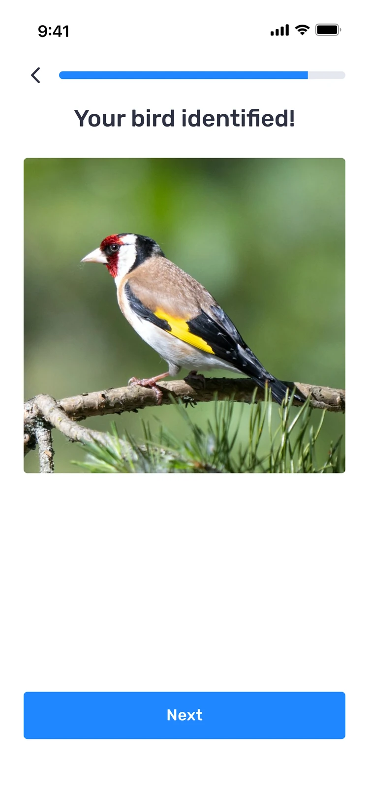
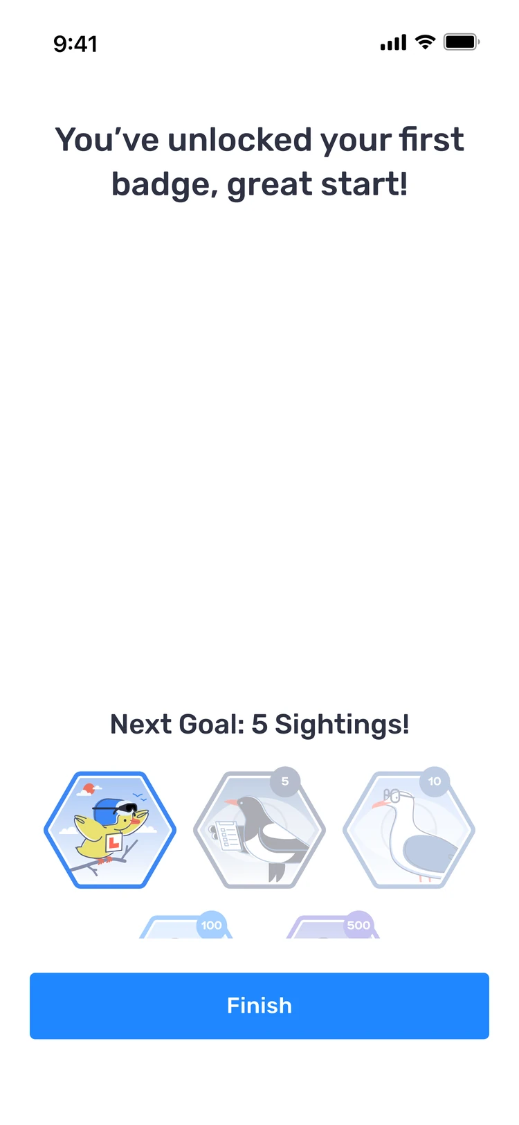
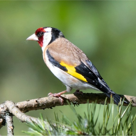
I brought it into onboarding, so new users could identify their first bird, using a sample photo or their own, before reaching the paywall.
“I’m so pleased photo ID is now a part of the app, I don’t have to use another app for this.”
Bringing Photo ID into onboarding
Once Photo ID had proved its value, the next step was to make it part of people’s first minutes in Birda, rather than something they found later. Instead of explaining it with copy, I let new users try it: they could identify their first bird with a sample photo or their own, before reaching the paywall.