Guided onboarding for a digital bank
Openbank is the Santander Group's digital bank. They brought us in to define and design the onboarding for their new app. I led the research and co-design, and shaped the guided experience that came out of it.








Context
The client
Openbank has no branches, so the app is the bank, and opening an account is the first thing anyone does in it. As the team finished the first version of the app, user testing kept pointing to the same problem: onboarding felt too long.
Openbank brought us in through Globant to get it right for phase 2. I led the discovery and co-design in London and Madrid, and shaped what the new onboarding should feel like.
Goal
The brief
The brief was discovery. Openbank wanted to understand what the perfect onboarding for a digital bank looked like to the people who would use it: how they wanted it to work, what it should ask for, how many steps it should have, and how it should feel. All while still asking for everything a bank needs by law. Our job was to hand over a clear vision the teams could build.
Research
What people told us
So we started by listening. I ran user interviews and three-hour co-design workshops with users in London and Madrid, and with Openbank's teams in Madrid. People mapped a normal day and every moment money came into it. They described the bank they wanted, and drew, screen by screen, how they would open an account on their phone. Alongside this, I looked at how other banks and apps handled sign-up, ran a SWOT, and built personas from what we learned.
Three things kept coming up, and only one of them was about speed. Not knowing how much was left felt worse than waiting. People wanted to know why we needed each thing. And they wanted it fast and simple, with someone to help along the way, like a chat.


Co-design sessions in London and Madrid

Process
From sketches to the full flow
Now we knew what the guide had to do: explain why, show progress, and keep it simple. I sketched the key moments on paper, from the first hello to signing with a fingerprint. Then I mapped the main path, and after it the full flow, with every error and every way back. We refined the flows with the team before shaping the final vision.


Sitemap

Flowchart
Solution
The final design
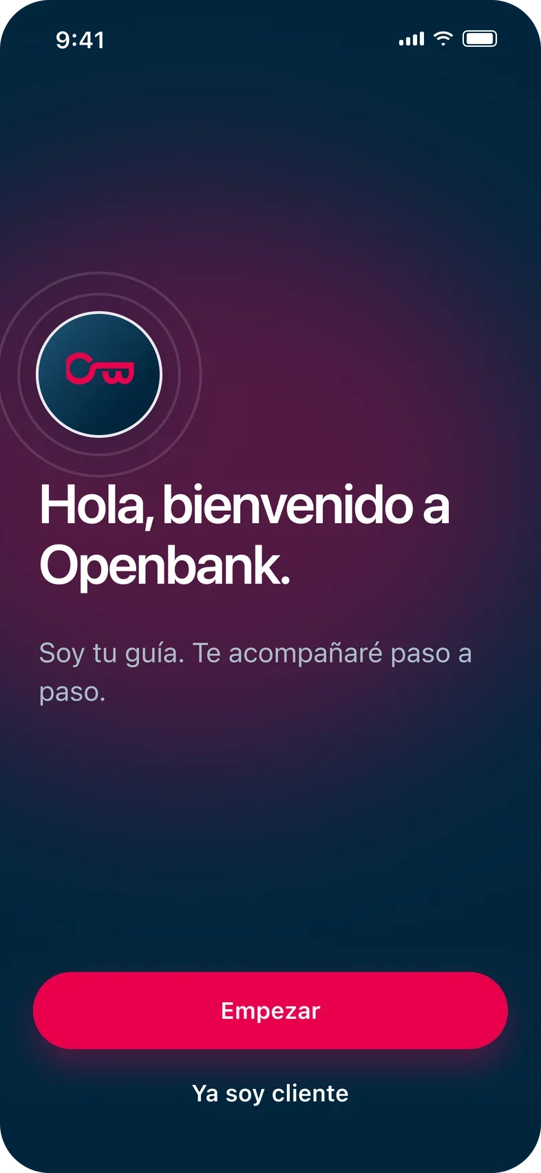
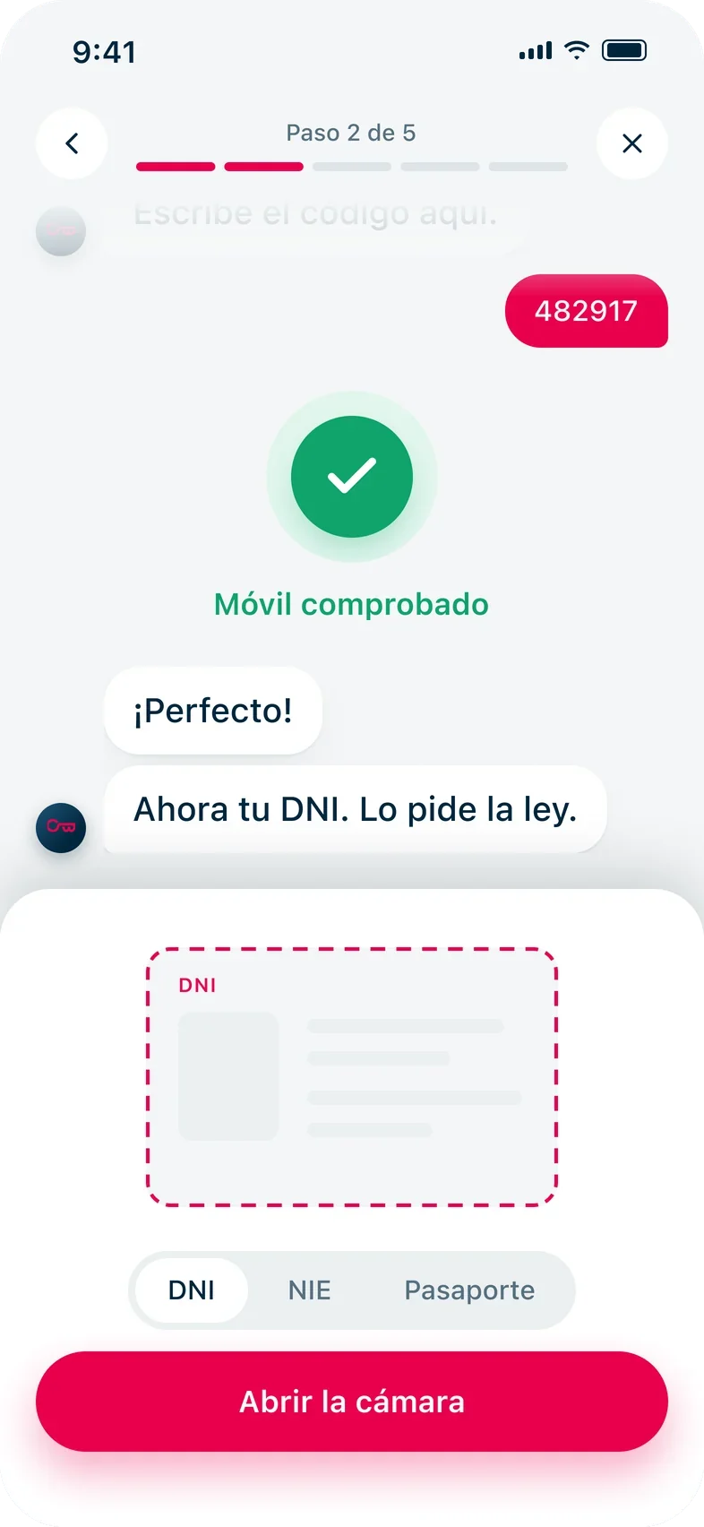
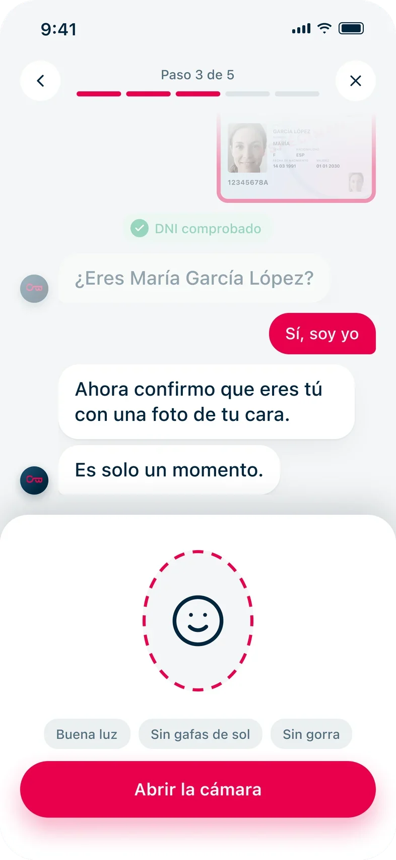
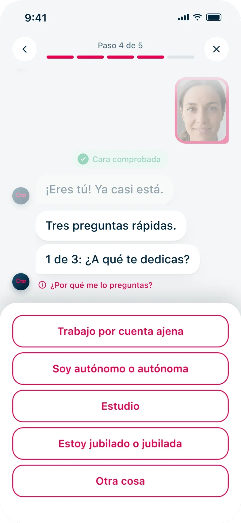
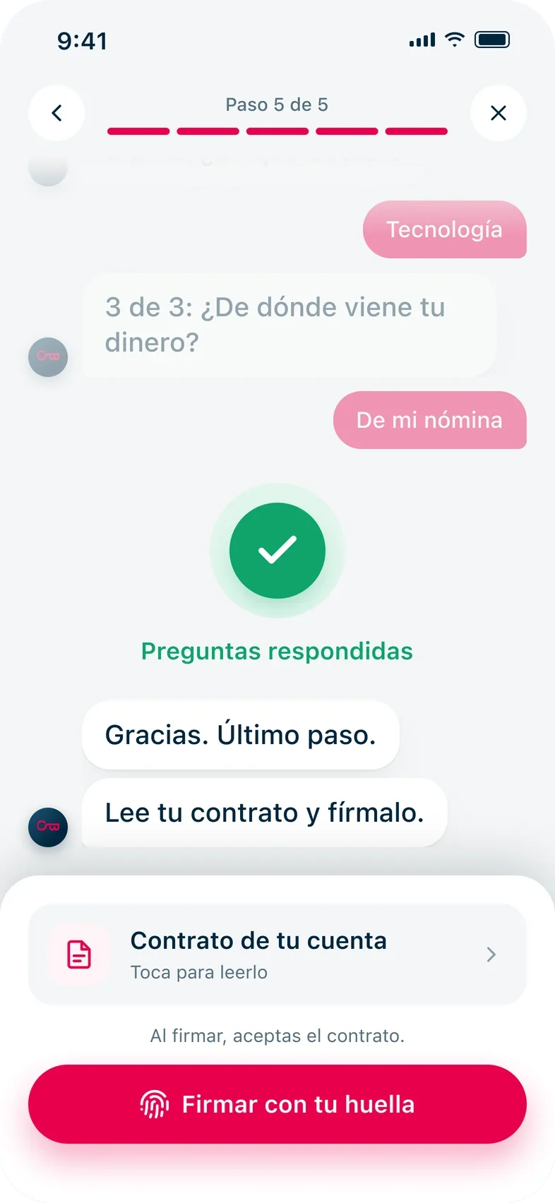
Opening an account became a conversation. The guide says hello on the second screen and stays until you sign with your fingerprint. It asks for one thing at a time, and a small progress bar shows what's left. If something goes wrong, such as a blurry photo of your ID, the guide says what happened and how to fix it. You can stop at any point and pick up where you left off. Or bring your details from Facebook, Google or LinkedIn, as people drew in the workshops.


The main path


When something goes wrong
Screens in Spanish, for customers in Spain

The full flow: the main path in red, other paths below

Impact
What happened next
We presented the vision to Openbank's teams in Madrid, and they backed it. Everyone left with one shared picture of what opening an account should feel like, built from what customers told us. Our work ended with the handover to Openbank's teams.